Today, after waiting for an album review to load, I built something small: my own take on the Pitchfork aggregate review loading experience.
Pitchfork uses a Skeleton-style UI while returning an album’s aggregate review, such as “8.0” for Mastodon’s Crack the Skye. Skeleton UIs show you something, like blurred text or a flashing bar, to build anticipation and fill out the page while in a loading state.
They are a fantastic UX touch for the right kind of app and data. In the case of the Pitchfork app, the aggregate review is a pivotal piece of information about an album, and is presumably being calculated on demand, so this choice makes sense.
My version
Here’s the version that I built. I added a review summary sentence, which was not part of the original design.
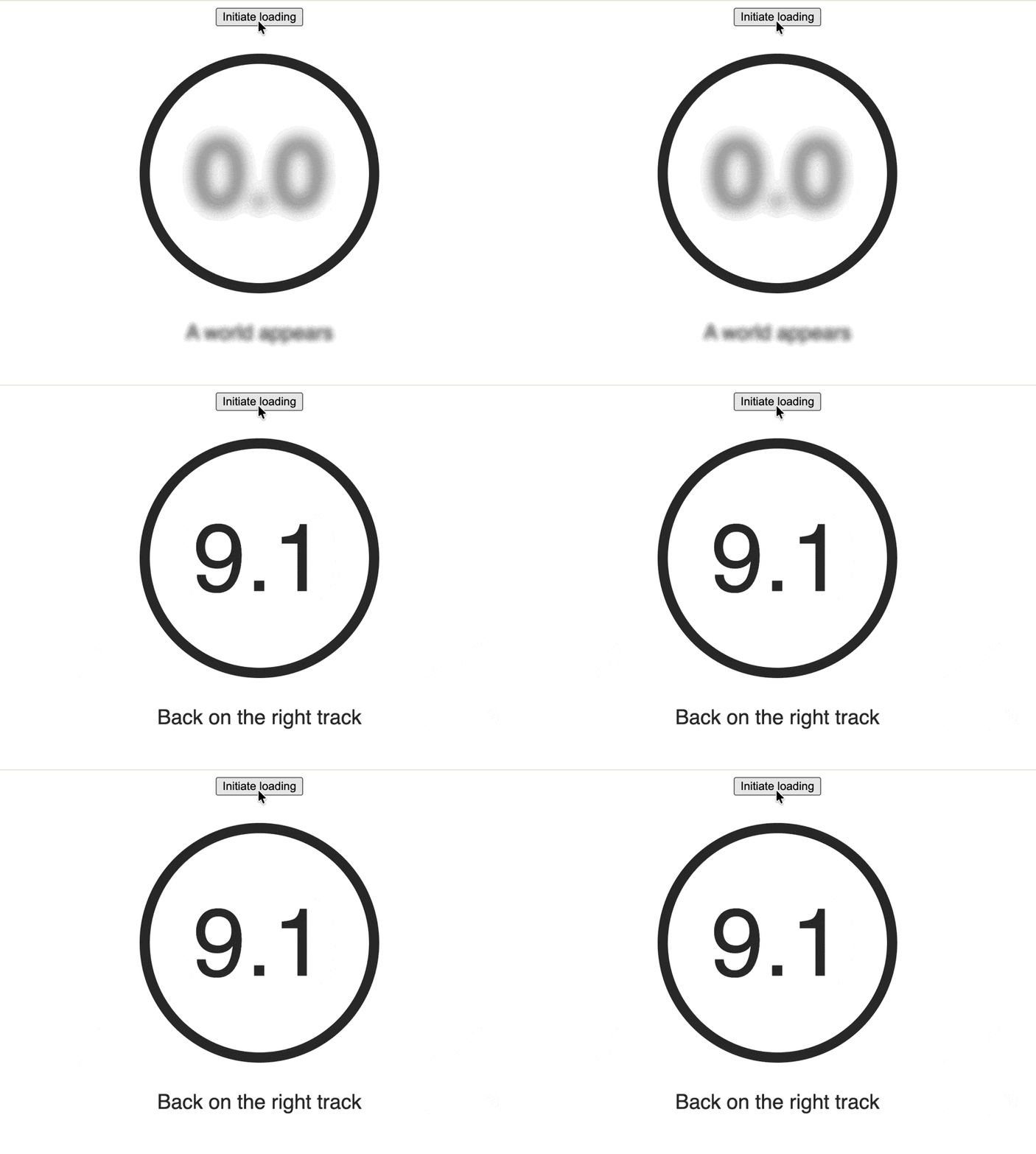
Why did I build this? I had curiosity and time. I’ve also felt that React Skeleton UI libraries always seem to do more than I want them to. I was wondering if I could build something smaller for a constrained use case, and I did.
The module code
I built this in two parts: a Node module handling the skeleton logic, and an application to consume it. I’ll share a few small learnings at the end.
Here’s the module:
// react-skeleton-loader/index.tsx
export interface SkeletonTextProps {
  blur?: number;
  className?: string;
  placeholder: string;
  value?: string;
}

export function SkeletonText({
  blur = 4,
  className,
  placeholder,
  value,
}: SkeletonTextProps) {
  const loading = value === undefined;
  const blurRadius = Math.min(12, Math.max(0, blur));

  return (
    <div className={className}>
      <span
        style={{
          filter: loading ? `blur(${blurRadius}px)` : 'none',
        }}
      >
        {loading ? placeholder : value}
      </span>
    </div>
  );
}
A couple of noteworthy points:
- A
blurprop that usesfilter: blur(radius)to customize how blurred the placeholder is on a scale of 0-12. I wanted the album’s rating to be more blurred than the copy, because it has a pretty consistent shape that a user can mentally “fill in” even when heavily blurred. - Inline styling and a placeholder value to create the skeleton experience.
- A
classNameso users can style the component; this library is about behavior, not style.
The consumer code
And here’s the consumer, edited for clarity.
// App.tsx
import {SkeletonText} from 'react-skeleton-loader';
import {useState} from 'react';

const App = () => {
  const [rating, setRating] = useState(undefined);
  const [copy, setCopy] = useState(undefined);

  const initiateLoading = () => {
    setTimeout(() => {
      setRating('9.1');
      setCopy('Back on the right track');
    }, 3000);
  };

  return (
    <>
      <button onClick={initiateLoading}>Initiate loading</button>

      <SkeletonText blur={9} placeholder="0.0" value={rating} />
      <SkeletonText blur={3} placeholder="A world appears" value={copy} />
    </>
  );
};
When rating or copy are defined, the skeleton UI considers itself loaded and
replaces the placeholder with the new value. Our 3000ms wait time simulates
loading.
What I learned
I’m going to share a few TILs here, now and as I add them.
- tsc watch script – The command I used to rebuild my module on write
- Link to Local Package With npm link – How I iterated on my local module in development
blur() CSS function– MDN